I found some interesting videos that incorporate the aesthetic qualities and sounds to soccer. It's frightening how similar this is to playing on the pitch. Based on the players around the first person and the colors of his teammates jerseys, it suggests who the first person player is (is in fact a professional player for Arsenal whose home country is the Netherlands). If you can tell me who this is, i'll draw you a personalized illustration of your choice!
Also a video that uses sounds for a musical advertisement. (although i'm not exactly sure why the break dancers are there).
20.10.08
visible language
Here is a concept for a book I created for typography. Using the poems of gertrude stein, I created layouts based on the ideas of fragmentation, cubism, collage, layering, and simultaneity. I played with repetition of sound and aligning all of the same words on a vertical axis. There are three different poem sections (objects, food, rooms), so I created three styles of type, each getting more structured as the book goes on. This not only allows me to split up the sections, but keeps the reader interested enough to keep going through the book. If i had all the spreads in the same manor, it would become boring and mundaine.
cover
dust jacket title page
contents
objects spread
objects spread (II)
food spread
rooms spread
colophon
cover

dust jacket
 title page
contents

objects spread

objects spread (II)

food spread

rooms spread

colophon

14.10.08
visual langage : final posters and statement
I wanted to create posters that were visually engaging not only to my demographic, but to anyone on the streets. Applying a hand made aesthetic is something rich and deep in mexican culture, so it was a must. by sampling from aztec drawings and carvings, i wanted to speak to the importance of mexican tradition. the fist poster is a parody because the headdress has icons that demonstrate a few concerns of my demographic. i chose to show education, health care, and the issues of war. I also added the two major parties into the collage. on my second poster, i used the hyperbole trope. i wanted to make this quite clear how quickley the say in immigration could be with their vote (the most populous demographic with the lowest voter turnout). i used physical maps so there was no mistake to what land mass i was referring to. i didn't want the rendering style or abstraction of my hand to change the true shape of their homeland. formally, the water is a texture i created and then cut into a mexican pattern. working with semiotics and using rhetorical devices helped me experiment formally and conceptually for the final outcome.
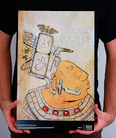
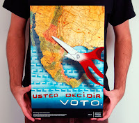


Visual Language Documentation: Rhetoric
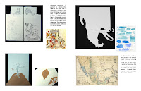
process
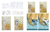
final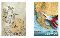
jr/sr crit:
over the course of our discussions, i received opinions on the way some of the icons looked on my aztec poster. it seemed to be a big jump from one idea to the other, so refinement of the icons themselves was mandatory. they understood the appropriate tropes and the impact they had. the suggestion of modernizing some of the icons as well was mentioned, but i chose to stick with traditional symbols for meaning. on the immigration poster, they mentioned lighting issues. i had to go back and change the angle of where the light sorce was dirriving from, to make it more realistic. overall i got some really insightful advice from my peers.


final

jr/sr crit:
over the course of our discussions, i received opinions on the way some of the icons looked on my aztec poster. it seemed to be a big jump from one idea to the other, so refinement of the icons themselves was mandatory. they understood the appropriate tropes and the impact they had. the suggestion of modernizing some of the icons as well was mentioned, but i chose to stick with traditional symbols for meaning. on the immigration poster, they mentioned lighting issues. i had to go back and change the angle of where the light sorce was dirriving from, to make it more realistic. overall i got some really insightful advice from my peers.
10.10.08
7.10.08
5.10.08
typographic mailer
in type class i was instructed to make a mailer for a font of my choice. i decided to research eric gill's typeface, gill sans. i learned he was an apprentice to morrison, while he was making the london underground typeface. while eric was contributing to the underground type, he was working on his own. morrison saw the typeface later and said it should have been the true face of the underground. knowing this, i wanted to incorporated underground by using the stairwells, mind the gap type on the ground, way out sign, and mapping.

cover with stairway leading to the inside

to the 'underground'

way out sign on the top right corner into the middle portion with information about the typeface

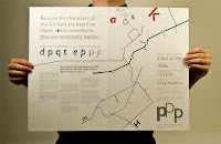
the back has the different types in the family on a sign board
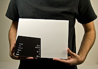

cover with stairway leading to the inside

to the 'underground'

way out sign on the top right corner into the middle portion with information about the typeface


the back has the different types in the family on a sign board

rhetoric
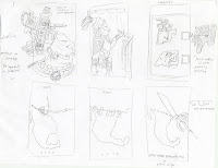
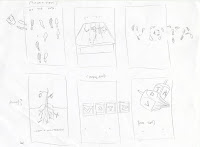
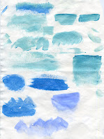
i am a little behind on the posting, so i am going to clump together a couple of steps for my voting rhetoric poster. the next step to this project was to make a matrix of images that were categorized in rhetoric terms and semiotics. after making these small thumbnail drawings, i drew six different directions i thought were best overall. finally i narrowed my choices down further, testing which materials would work best for each choice.






Subscribe to:
Posts (Atom)

